All case studies →
Insurance · Reserving
Making complex reserving workflows easier to navigate
Designing clearer workflows for expert users working with complex, data-heavy reserving processes.
Role
Senior Product Designer
Period
2024 - 2026
Duration
2 years
Team
Product, Engineering & actuarial experts
The challenge
Expert users were working through long analytical journeys with a lot of information to hold in mind. I focused on making those journeys easier to follow without oversimplifying the underlying work.
My role
I worked end to end across discovery, workflow design, interaction design and delivery, collaborating closely with Product, Engineering and domain experts.
What I focused on
Finding where users lost context or needed more guidance. Making long analytical journeys clearer and more predictable. Balancing guidance with the flexibility experienced users still needed.
Design principle
This work shaped how I approach complex B2B products today: simplify the path through the problem, not the expertise behind it.
35+
User interviews & usability tests
3
Major features worked on
4
External design partners
10+ yrs
Legacy desktop app replaced
What is Reserving
Every insurance claim represents money that may be paid over months or even years. Reserving actuaries estimate those future costs so insurers can understand their financial position, meet regulatory requirements and make informed business decisions.
Their work combines historical claims data, statistical models and professional judgement, making transparency and explainability just as important as accuracy.
01
Understanding the workflow
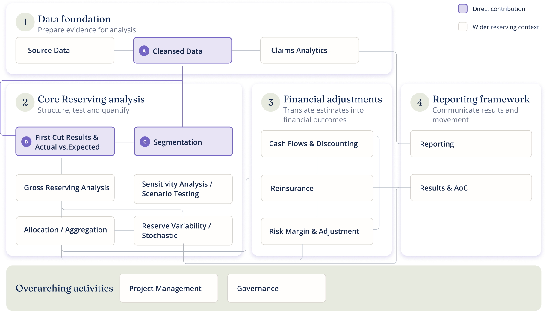
Before designing anything, I wanted to understand the domain from the inside. Together with another designer, I mapped the full reserving workflow end to end, creating a shared view across Product, Engineering and actuarial experts.
What became clear early was that the workflow wasn't linear. Activities could change order, users returned to earlier work as assumptions evolved, and different insurers organised the process differently. That shaped everything that came next.
A simplified view of the broader reserving workflow
Jobs to be done
Looking at the workflow alone was not enough. I also needed to understand what users were trying to achieve at each stage, and where the experience was getting in the way.
I synthesised research into a Jobs To Be Done framework covering 8 roles and 15 activities, refined in sessions with domain experts until it reflected how reserving teams actually worked.
8
roles
15
activities
Eight roles across fifteen activities revealed a network of handovers, revisits and shared decisions.


1
Mapped JTBD cluster


5
Stacked cluster / higher density
|
The number in each note cluster shows mapped JTBD items.
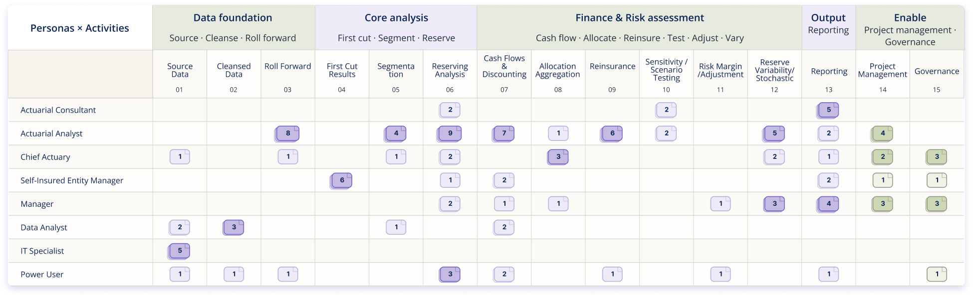
Rather than treating every issue as a separate feature request, I used these jobs as a reference point for reasoning about the experience across the workflow.
Structure
The workflow is a network.
Activities can change order, and users return to earlier work as evidence and assumptions evolve.
Collaboration
Ownership shifts across roles.
Specialists, analysts and decision-makers need visible status, safe handovers and flexible permissions.
Trust
Decisions must survive scrutiny.
Reporting, governance and expert review make traceability part of the product experience.
02
Three design challenges
I focused on three areas of the reserving workflow where the design work had the most downstream impact. Each one started with a research finding that changed the direction.
01
Data Import
Getting context before starting
Reserving starts with getting large amounts of data into a usable state. I focused on making the import process easier to follow, particularly around progress, validation, errors and what users needed to do next.
Starting assumption
“One person owns the setup”
Our first design treated setup as a single-user journey. Research revealed the real problem: different insurers divided the work across several people, which changed the product problem from guided setup to coordinated progress.
What I explored
The design challenge was less about the mechanics of uploading a file and more about helping users understand what had happened, what still needed attention and when they were ready to move forward.

Data / New Data File
✓
✓
3
4
Data Import
Started
1
Initial contributor
A team member starts the import, uploads source data and begins configuration, but does not need to complete all steps.
Data / New Data File
✓
✓
3
4
Data Import
Partial
2
Saved incomplete state
Progress is saved. The import shows exactly how far it got and what still needs completing. Safe to leave, ready to resume.
Data / New Data File
✓
✓
✓
4
Data Import
Resumed
3
Next contributor
A second team member picks up where the first left off, with full context: no duplication, no loss of progress.
One workflow for multiple people.
02
Actual vs Expected
Moving from noticing to understanding
Actual vs Expected analysis (AvE) helps actuaries understand how experience has changed compared with previous expectations. The design challenge was helping users move from seeing that something had changed to understanding where it changed, what contributed to it and what deserved further investigation.
I focused on making that investigation easier to navigate without hiding the detail experts needed to form their own judgement.
Observed result
2019
2020
2021
2022
2023
vs
Previous expectation
2019
2020
2021
2022
2023
A meaningful difference appears
2023 shows the largest deviation. Actual is significantly below expectation.

1
WHERE?
Identify the affected area
Which period or group shows the largest deviation?
2
WHY?
Explore possible contributors
What combinations of factors might explain the shift?
3
WHAT NEXT?
Decide what deserves attention
Which findings warrant further investigation?
Design response
Show actual, expected and difference together so the context is always visible.
Separate paid and incurred views to reduce interpretation ambiguity.
Follow familiar actuarial period ordering so analysts can move quickly.
The investigation journey: from noticing a difference to deciding what deserves attention.
Key findings that changed the direction.
Representative selection from 12 prioritised recommendations
P0
Remove interpretation ambiguity
Finding
Paid and incurred combined views made sorting and interpretation unclear.
Action
Split the views and label the sorting basis.
P0
Add context to the difference
Finding
The difference alone was insufficient in the drill-down view.
Action
Expose actual and expected values; support an overview toggle.
P1
Respect actuarial chronology
Finding
Accident years appeared in the wrong order for established working habits.
Action
Place the most recent period consistently at the bottom.
P4
Enable quick visual triage
Finding
There was no threshold or alert for finding meaningful deviations quickly.
Action
Explore a user-defined, draggable threshold line.
03
Segmentation
Keeping context across levels
Reserving analysis often requires moving between different segments and levels of information. I focused on helping users change scope without losing context, while keeping complex hierarchies understandable.
Design challenge
How do you help users explore new ways of organising their data without disrupting the structures they already trust?
Starting assumption
“Maximum flexibility first”
We initially prioritised maximum flexibility through a powerful query builder. Usability testing showed users first needed the interaction to reflect the language and reasoning they already used.
What I changed
I explored hierarchy, navigation and progressive disclosure as ways to make it easier to move between levels without putting every possible option on screen at once.
Key findings that shaped the direction.
Representative selection from 9 prioritised recommendations
Make complex operators understandable
Finding
The Breakdown by operator (to create multiple segments with one single query) was powerful but not understandable.
Action
Rename it using plain language and introduce contextual guidance.
Reveal logic before commitment
Finding
The AND/OR interaction forced users to commit before understanding the logical relationship.
Action
Redesign the flow so logical operators are chosen before selecting a field.
Make lifecycle consequences explicit
Finding
Users struggled to understand how segmentation changes affected historical analyses.
Action
Introduce clearer lifecycle decisions and explicit retroactive vs. prospective behaviour.
Support governed collaboration
Finding
Collaboration around segmentation needed stronger governance.
Action
Preserve and expand assignee, reviewer and status metadata to support team workflows.
Portfolio
Group A
Segment 01
Viewing
Segment 02
Group B
Segment 03
Segment 04
Portfolio
/
Group A
/
Segment 01
01
Segment 01
Group A
Active
Definition
Line of Business = Motor AND Accident Year ≥ 2019
Analyses affected
7
Last modified
Aug 2026
Structural changes apply prospectively. Historical analyses using this segment will not be affected.
Design principle
Always show where you are in the hierarchy and what consequences a change will have before asking for commitment.
Keeping context visible when navigating between levels of a complex hierarchy.
03
What I learned
Working in reserving reinforced something that now shapes a lot of my product work: complexity is not always the problem. Expert users often need the underlying complexity. The design challenge is creating enough structure, context and orientation for them to work with it confidently.
I became much more deliberate about separating domain complexity from interface complexity, preserving the former when it was valuable, while reducing the latter wherever possible.
Design principle
Complex systems don’t need to become simple. They need to become understandable.
What shipped, what research changed and how the team’s product practice evolved.
Impact
Product
Data Import and AvE shipped to customers and were validated through real-world Design Partner testing.
Research findings directly shaped core workflows and influenced roadmap priorities.
The platform supported different organisational models without forcing customers to change established ways of working.
Team
Discovery evolved from an isolated phase into a continuous product practice.
User research became shared evidence for prioritisation and product decisions.
Earlier Engineering involvement brought architectural constraints into solution design before implementation.
How the working practice changed
1
Product
Insights from interviews and usability testing regularly influenced roadmap discussions and feature prioritisation. As my understanding of the domain grew, I became increasingly involved in writing user stories, defining acceptance criteria and providing implementation context for the squad.
2
Engineering
Initially, Engineering joined the process once solutions had already been defined. Through later process improvements, we started involving Tech Leads earlier in solution discussions, allowing architectural considerations to shape the design before implementation. This collaboration led to stronger, more sustainable solutions.
3
Users
Discovery became a continuous activity rather than a project milestone. Regular interviews, usability testing and eventually Design Partners helped us validate assumptions, uncover new opportunities and keep product decisions grounded in real user needs.
Reflection
This work reinforced that senior product design is not only about resolving interfaces. It is about making a complex domain legible, connecting evidence to product decisions and creating the conditions for a cross-functional team to deliver the right solution.
“I grew from designing workflows to shaping how the team understood the problem, prioritised opportunities and made product decisions.”
All case studies →
Insurance · Reserving
Making complex reserving workflows easier to navigate
Designing clearer workflows for expert users working with complex, data-heavy reserving processes.
Role
Senior Product Designer
Period
2024 - 2026
Duration
2 years
Team
Product, Engineering & actuarial experts
The challenge
Expert users were working through long analytical journeys with a lot of information to hold in mind. I focused on making those journeys easier to follow without oversimplifying the underlying work.
My role
I worked end to end across discovery, workflow design, interaction design and delivery, collaborating closely with Product, Engineering and domain experts.
What I focused on
Finding where users lost context or needed more guidance. Making long analytical journeys clearer and more predictable. Balancing guidance with the flexibility experienced users still needed.
Design principle
This work shaped how I approach complex B2B products today: simplify the path through the problem, not the expertise behind it.
35+
User interviews & usability tests
3
Major features worked on
4
External design partners
10+ yrs
Legacy desktop app replaced
What is Reserving
Every insurance claim represents money that may be paid over months or even years. Reserving actuaries estimate those future costs so insurers can understand their financial position, meet regulatory requirements and make informed business decisions.
Their work combines historical claims data, statistical models and professional judgement, making transparency and explainability just as important as accuracy.
01
Understanding the workflow
Before designing anything, I wanted to understand the domain from the inside. Together with another designer, I mapped the full reserving workflow end to end, creating a shared view across Product, Engineering and actuarial experts.
What became clear early was that the workflow wasn't linear. Activities could change order, users returned to earlier work as assumptions evolved, and different insurers organised the process differently. That shaped everything that came next.
A simplified view of the broader reserving workflow
Jobs to be done
Looking at the workflow alone was not enough. I also needed to understand what users were trying to achieve at each stage, and where the experience was getting in the way.
I synthesised research into a Jobs To Be Done framework covering 8 roles and 15 activities, refined in sessions with domain experts until it reflected how reserving teams actually worked.
8
roles
15
activities
Eight roles across fifteen activities revealed a network of handovers, revisits and shared decisions.
1
Mapped JTBD cluster
5
Stacked cluster / higher density
|
The number in each note cluster shows mapped JTBD items.
Rather than treating every issue as a separate feature request, I used these jobs as a reference point for reasoning about the experience across the workflow.
Structure
The workflow is a network.
Activities can change order, and users return to earlier work as evidence and assumptions evolve.
Collaboration
Ownership shifts across roles.
Specialists, analysts and decision-makers need visible status, safe handovers and flexible permissions.
Trust
Decisions must survive scrutiny.
Reporting, governance and expert review make traceability part of the product experience.
02
Three design challenges
I focused on three areas of the reserving workflow where the design work had the most downstream impact. Each one started with a research finding that changed the direction.
01
Data Import
Getting context before starting
Reserving starts with getting large amounts of data into a usable state. I focused on making the import process easier to follow, particularly around progress, validation, errors and what users needed to do next.
Starting assumption
“One person owns the setup”
Our first design treated setup as a single-user journey. Research revealed the real problem: different insurers divided the work across several people, which changed the product problem from guided setup to coordinated progress.
What I explored
The design challenge was less about the mechanics of uploading a file and more about helping users understand what had happened, what still needed attention and when they were ready to move forward.
Data / New Data File
✓
✓
3
4
Data Import
Started
1
Initial contributor
A team member starts the import, uploads source data and begins configuration, but does not need to complete all steps.
Data / New Data File
✓
✓
3
4
Data Import
Partial
2
Saved incomplete state
Progress is saved. The import shows exactly how far it got and what still needs completing. Safe to leave, ready to resume.
Data / New Data File
✓
✓
✓
4
Data Import
Resumed
3
Next contributor
A second team member picks up where the first left off, with full context: no duplication, no loss of progress.
One workflow for multiple people.
02
Actual vs Expected
Moving from noticing to understanding
Actual vs Expected analysis (AvE) helps actuaries understand how experience has changed compared with previous expectations. The design challenge was helping users move from seeing that something had changed to understanding where it changed, what contributed to it and what deserved further investigation.
I focused on making that investigation easier to navigate without hiding the detail experts needed to form their own judgement.
Observed result
2019
2020
2021
2022
2023
vs
Previous expectation
2019
2020
2021
2022
2023
2023 shows the largest deviation. Actual is significantly below expectation.
DIFFERENCE
-26
1
WHERE?
Identify the affected area
Which period or group shows the largest deviation?
2
WHY?
Explore possible contributors
What combinations of factors might explain the shift?
3
WHAT NEXT?
Decide what deserves attention
Which findings warrant further investigation?
Design response
Show actual, expected and difference together so the context is always visible.
Separate paid and incurred views to reduce interpretation ambiguity.
Follow familiar actuarial period ordering so analysts can move quickly.
The investigation journey: from noticing a difference to deciding what deserves attention.
Key findings that changed the direction.
Representative selection from 12 prioritised recommendations
P0
Remove interpretation ambiguity
Finding
Paid and incurred combined views made sorting and interpretation unclear.
Action
Split the views and label the sorting basis.
P0
Add context to the difference
Finding
The difference alone was insufficient in the drill-down view.
Action
Expose actual and expected values; support an overview toggle.
P1
Respect actuarial chronology
Finding
Accident years appeared in the wrong order for established working habits.
Action
Place the most recent period consistently at the bottom.
P4
Enable quick visual triage
Finding
There was no threshold or alert for finding meaningful deviations quickly.
Action
Explore a user-defined, draggable threshold line.
03
Segmentation
Keeping context across levels
Reserving analysis often requires moving between different segments and levels of information. I focused on helping users change scope without losing context, while keeping complex hierarchies understandable.
Design challenge
How do you help users explore new ways of organising their data without disrupting the structures they already trust?
Starting assumption
“Maximum flexibility first”
We initially prioritised maximum flexibility through a powerful query builder. Usability testing showed users first needed the interaction to reflect the language and reasoning they already used.
What I changed
I explored hierarchy, navigation and progressive disclosure as ways to make it easier to move between levels without putting every possible option on screen at once.
Key findings that shaped the direction.
Representative selection from 9 prioritised recommendations
Make complex operators understandable
Finding
The Breakdown by operator (to create multiple segments with one single query) was powerful but not understandable.
Action
Rename it using plain language and introduce contextual guidance.
Reveal logic before commitment
Finding
The AND/OR interaction forced users to commit before understanding the logical relationship.
Action
Redesign the flow so logical operators are chosen before selecting a field.
Make lifecycle consequences explicit
Finding
Users struggled to understand how segmentation changes affected historical analyses.
Action
Introduce clearer lifecycle decisions and explicit retroactive vs. prospective behaviour.
Support governed collaboration
Finding
Collaboration around segmentation needed stronger governance.
Action
Preserve and expand assignee, reviewer and status metadata to support team workflows.
Portfolio
Group A
Segment 01
Viewing
Segment 02
Group B
Segment 03
Segment 04
Portfolio
/
Group A
/
Segment 01
01
Segment 01
Group A
Active
Definition
Line of Business = Motor AND Accident Year ≥ 2019
Analyses affected
7
Last modified
Aug 2026
Structural changes apply prospectively. Historical analyses using this segment will not be affected.
Design principle
Always show where you are in the hierarchy and what consequences a change will have before asking for commitment.
Keeping context visible when navigating between levels of a complex hierarchy.
03
What I learned
Working in reserving reinforced something that now shapes a lot of my product work: complexity is not always the problem. Expert users often need the underlying complexity. The design challenge is creating enough structure, context and orientation for them to work with it confidently.
I became much more deliberate about separating domain complexity from interface complexity, preserving the former when it was valuable, while reducing the latter wherever possible.
Design principle
Complex systems don’t need to become simple. They need to become understandable.
What shipped, what research changed and how the team’s product practice evolved.
Impact
Product
Data Import and AvE shipped to customers and were validated through real-world Design Partner testing.
Research findings directly shaped core workflows and influenced roadmap priorities.
The platform supported different organisational models without forcing customers to change established ways of working.
Team
Discovery evolved from an isolated phase into a continuous product practice.
User research became shared evidence for prioritisation and product decisions.
Earlier Engineering involvement brought architectural constraints into solution design before implementation.
How the working practice changed
1
Product
Insights from interviews and usability testing regularly influenced roadmap discussions and feature prioritisation. As my understanding of the domain grew, I became increasingly involved in writing user stories, defining acceptance criteria and providing implementation context for the squad.
2
Engineering
Initially, Engineering joined the process once solutions had already been defined. Through later process improvements, we started involving Tech Leads earlier in solution discussions, allowing architectural considerations to shape the design before implementation. This collaboration led to stronger, more sustainable solutions.
3
Users
Discovery became a continuous activity rather than a project milestone. Regular interviews, usability testing and eventually Design Partners helped us validate assumptions, uncover new opportunities and keep product decisions grounded in real user needs.
Reflection
This work reinforced that senior product design is not only about resolving interfaces. It is about making a complex domain legible, connecting evidence to product decisions and creating the conditions for a cross-functional team to deliver the right solution.
“I grew from designing workflows to shaping how the team understood the problem, prioritised opportunities and made product decisions.”
All case studies →
Insurance · Reserving
Making complex reserving workflows easier to navigate
Designing clearer workflows for expert users working with complex, data-heavy reserving processes.
Role
Senior Product Designer
Period
2024 - 2026
Duration
2 years
Team
Product, Engineering & actuarial experts
The challenge
Expert users were working through long analytical journeys with a lot of information to hold in mind. I focused on making those journeys easier to follow without oversimplifying the underlying work.
My role
I worked end to end across discovery, workflow design, interaction design and delivery, collaborating closely with Product, Engineering and domain experts.
What I focused on
Finding where users lost context or needed more guidance. Making long analytical journeys clearer and more predictable. Balancing guidance with the flexibility experienced users still needed.
Design principle
This work shaped how I approach complex B2B products today: simplify the path through the problem, not the expertise behind it.
35+
User interviews & usability tests
3
Major features worked on
4
External design partners
10+ yrs
Legacy desktop app replaced
What is Reserving
Every insurance claim represents money that may be paid over months or even years. Reserving actuaries estimate those future costs so insurers can understand their financial position, meet regulatory requirements and make informed business decisions.
Their work combines historical claims data, statistical models and professional judgement, making transparency and explainability just as important as accuracy.
01
Understanding the workflow
Before designing anything, I wanted to understand the domain from the inside. Together with another designer, I mapped the full reserving workflow end to end, creating a shared view across Product, Engineering and actuarial experts.
What became clear early was that the workflow wasn't linear. Activities could change order, users returned to earlier work as assumptions evolved, and different insurers organised the process differently. That shaped everything that came next.
A simplified view of the broader reserving workflow
Jobs to be done
Looking at the workflow alone was not enough. I also needed to understand what users were trying to achieve at each stage, and where the experience was getting in the way.
I synthesised research into a Jobs To Be Done framework covering 8 roles and 15 activities, refined in sessions with domain experts until it reflected how reserving teams actually worked.
8
roles
15
activities
Eight roles across fifteen activities revealed a network of handovers, revisits and shared decisions.
1
Mapped JTBD cluster
5
Stacked cluster / higher density
|
The number in each note cluster shows mapped JTBD items.
Rather than treating every issue as a separate feature request, I used these jobs as a reference point for reasoning about the experience across the workflow.
Structure
The workflow is a network.
Activities can change order, and users return to earlier work as evidence and assumptions evolve.
Collaboration
Ownership shifts across roles.
Specialists, analysts and decision-makers need visible status, safe handovers and flexible permissions.
Trust
Decisions must survive scrutiny.
Reporting, governance and expert review make traceability part of the product experience.
02
Three design challenges
I focused on three areas of the reserving workflow where the design work had the most downstream impact. Each one started with a research finding that changed the direction.
01
Data Import
Getting context before starting
Reserving starts with getting large amounts of data into a usable state. I focused on making the import process easier to follow, particularly around progress, validation, errors and what users needed to do next.
Starting assumption
“One person owns the setup”
Our first design treated setup as a single-user journey. Research revealed the real problem: different insurers divided the work across several people, which changed the product problem from guided setup to coordinated progress.
What I explored
The design challenge was less about the mechanics of uploading a file and more about helping users understand what had happened, what still needed attention and when they were ready to move forward.
Data / New Data File
✓
✓
3
4
Data Import
Started
1
Initial contributor
A team member starts the import, uploads source data and begins configuration, but does not need to complete all steps.
Data / New Data File
✓
✓
3
4
Data Import
Partial
2
Saved incomplete state
Progress is saved. The import shows exactly how far it got and what still needs completing. Safe to leave, ready to resume.
Data / New Data File
✓
✓
✓
4
Data Import
Resumed
3
Next contributor
A second team member picks up where the first left off, with full context: no duplication, no loss of progress.
One workflow for multiple people.
02
Actual vs Expected
Moving from noticing to understanding
Actual vs Expected analysis (AvE) helps actuaries understand how experience has changed compared with previous expectations. The design challenge was helping users move from seeing that something had changed to understanding where it changed, what contributed to it and what deserved further investigation.
I focused on making that investigation easier to navigate without hiding the detail experts needed to form their own judgement.
Observed result
2019
2020
2021
2022
2023
vs
Previous expectation
2019
2020
2021
2022
2023
2023 shows the largest deviation. Actual is significantly below expectation.
DIFFERENCE
-26

1
WHERE?
Identify the affected area
Which period or group shows the largest deviation?
2
WHY?
Explore possible contributors
What combinations of factors might explain the shift?
3
WHAT NEXT?
Decide what deserves attention
Which findings warrant further investigation?
Design response
Show actual, expected and difference together so the context is always visible.
Separate paid and incurred views to reduce interpretation ambiguity.
Follow familiar actuarial period ordering so analysts can move quickly.
The investigation journey: from noticing a difference to deciding what deserves attention.
Key findings that changed the direction.
Representative selection from 12 prioritised recommendations
P0
Remove interpretation ambiguity
Finding
Paid and incurred combined views made sorting and interpretation unclear.
Action
Split the views and label the sorting basis.
P0
Add context to the difference
Finding
The difference alone was insufficient in the drill-down view.
Action
Expose actual and expected values; support an overview toggle.
P1
Respect actuarial chronology
Finding
Accident years appeared in the wrong order for established working habits.
Action
Place the most recent period consistently at the bottom.
P4
Enable quick visual triage
Finding
There was no threshold or alert for finding meaningful deviations quickly.
Action
Explore a user-defined, draggable threshold line.
03
Segmentation
Keeping context across levels
Reserving analysis often requires moving between different segments and levels of information. I focused on helping users change scope without losing context, while keeping complex hierarchies understandable.
Design challenge
How do you help users explore new ways of organising their data without disrupting the structures they already trust?
Starting assumption
“Maximum flexibility first”
We initially prioritised maximum flexibility through a powerful query builder. Usability testing showed users first needed the interaction to reflect the language and reasoning they already used.
What I changed
I explored hierarchy, navigation and progressive disclosure as ways to make it easier to move between levels without putting every possible option on screen at once.
Key findings that shaped the direction.
Representative selection from 9 prioritised recommendations
Make complex operators understandable
Finding
The Breakdown by operator (to create multiple segments with one single query) was powerful but not understandable.
Action
Rename it using plain language and introduce contextual guidance.
Reveal logic before commitment
Finding
The AND/OR interaction forced users to commit before understanding the logical relationship.
Action
Redesign the flow so logical operators are chosen before selecting a field.
Make lifecycle consequences explicit
Finding
Users struggled to understand how segmentation changes affected historical analyses.
Action
Introduce clearer lifecycle decisions and explicit retroactive vs. prospective behaviour.
Support governed collaboration
Finding
Collaboration around segmentation needed stronger governance.
Action
Preserve and expand assignee, reviewer and status metadata to support team workflows.
Portfolio
Group A
Segment 01
Viewing
Segment 02
Group B
Segment 03
Segment 04
Portfolio
/
Group A
/
Segment 01
01
Segment 01
Group A
Active
Definition
Line of Business = Motor AND Accident Year ≥ 2019
Analyses affected
7
Last modified
Aug 2026
Structural changes apply prospectively. Historical analyses using this segment will not be affected.
Design principle
Always show where you are in the hierarchy and what consequences a change will have before asking for commitment.
Keeping context visible when navigating between levels of a complex hierarchy.
03
What I learned
Working in reserving reinforced something that now shapes a lot of my product work: complexity is not always the problem. Expert users often need the underlying complexity. The design challenge is creating enough structure, context and orientation for them to work with it confidently.
I became much more deliberate about separating domain complexity from interface complexity, preserving the former when it was valuable, while reducing the latter wherever possible.
Design principle
Complex systems don’t need to become simple. They need to become understandable.
What shipped, what research changed and how the team’s product practice evolved.
Impact
Product
Data Import and AvE shipped to customers and were validated through real-world Design Partner testing.
Research findings directly shaped core workflows and influenced roadmap priorities.
The platform supported different organisational models without forcing customers to change established ways of working.
Team
Discovery evolved from an isolated phase into a continuous product practice.
User research became shared evidence for prioritisation and product decisions.
Earlier Engineering involvement brought architectural constraints into solution design before implementation.
How the working practice changed
1
Product
Insights from interviews and usability testing regularly influenced roadmap discussions and feature prioritisation. As my understanding of the domain grew, I became increasingly involved in writing user stories, defining acceptance criteria and providing implementation context for the squad.
2
Engineering
Initially, Engineering joined the process once solutions had already been defined. Through later process improvements, we started involving Tech Leads earlier in solution discussions, allowing architectural considerations to shape the design before implementation. This collaboration led to stronger, more sustainable solutions.
3
Users
Discovery became a continuous activity rather than a project milestone. Regular interviews, usability testing and eventually Design Partners helped us validate assumptions, uncover new opportunities and keep product decisions grounded in real user needs.
Reflection
This work reinforced that senior product design is not only about resolving interfaces. It is about making a complex domain legible, connecting evidence to product decisions and creating the conditions for a cross-functional team to deliver the right solution.
“I grew from designing workflows to shaping how the team understood the problem, prioritised opportunities and made product decisions.”